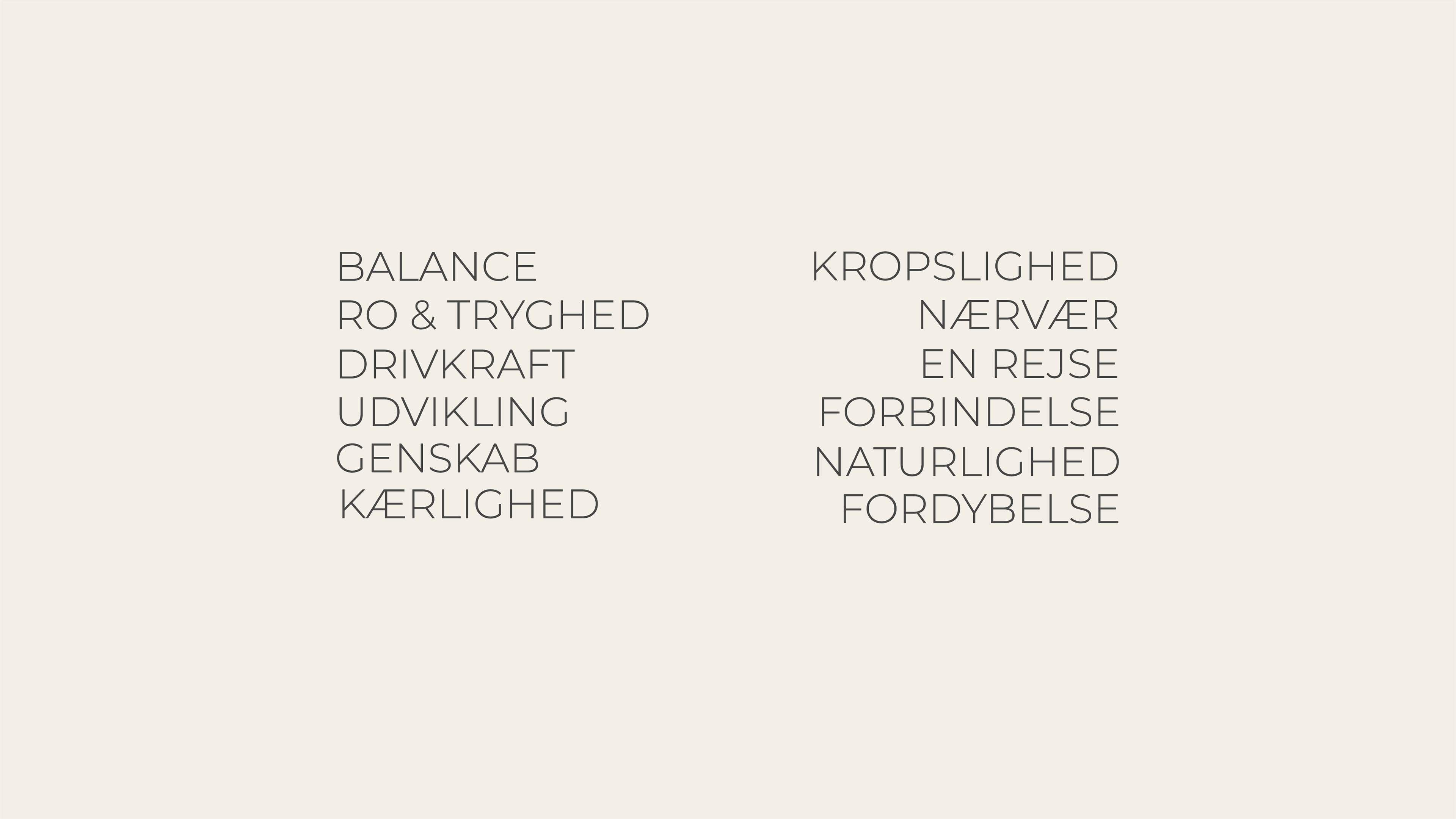
Words I wrote down to get a sense of direction in the initial phase of the project
Moodboard for developing the visual language
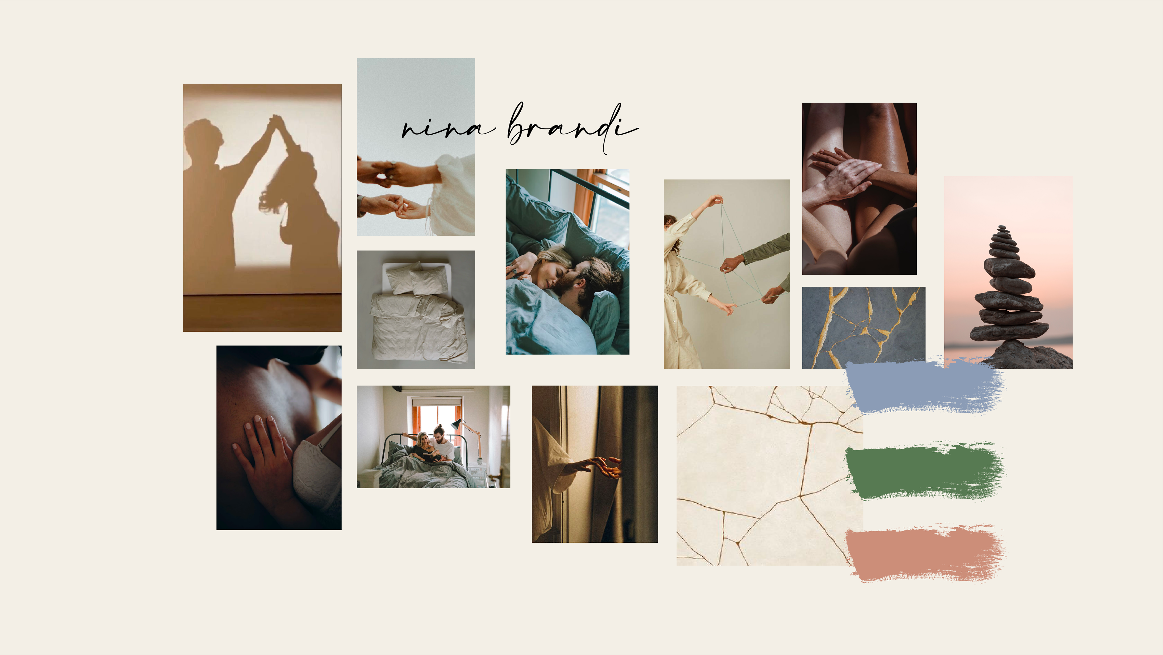
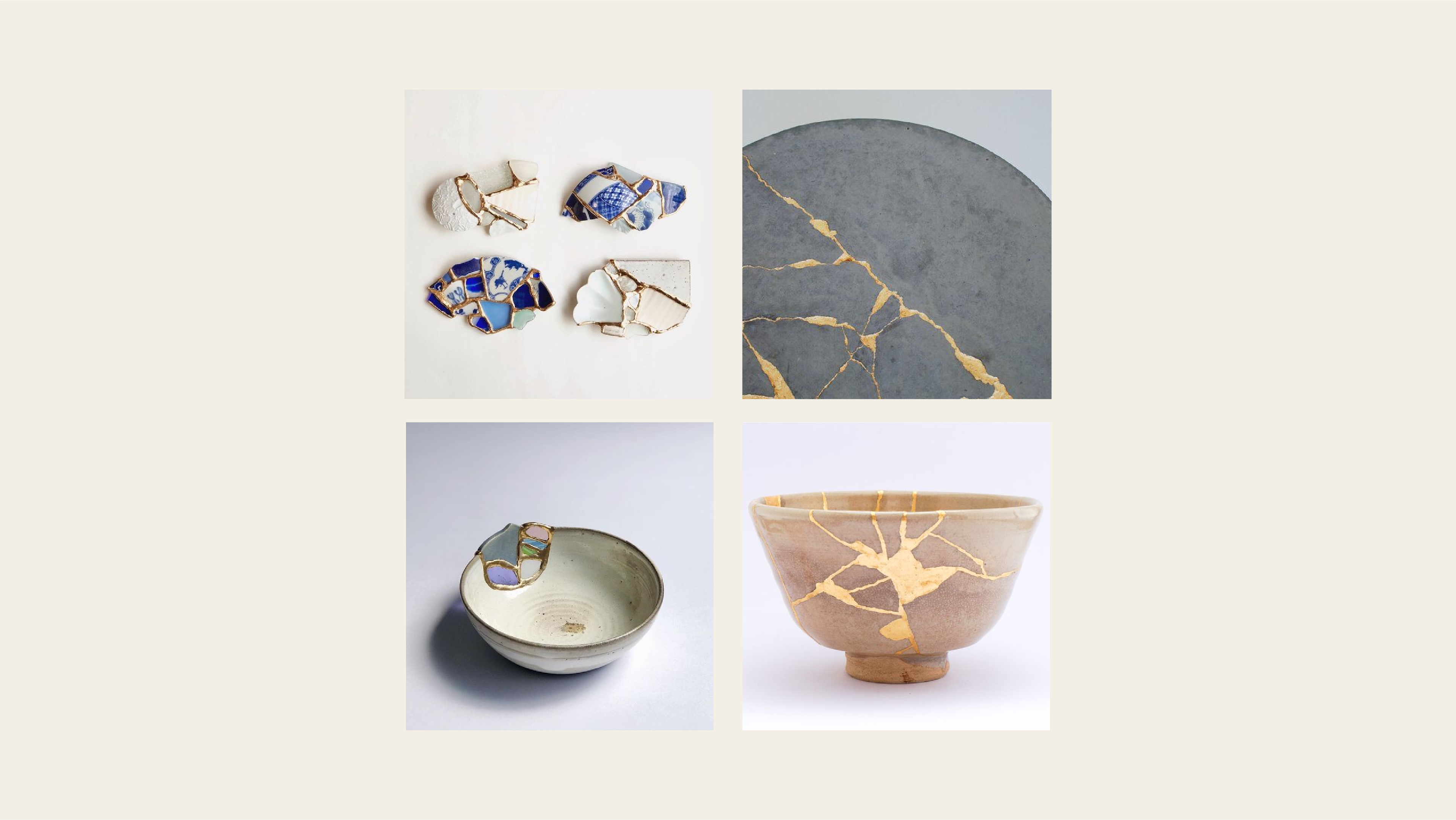
Photo and atmosphere moodboard
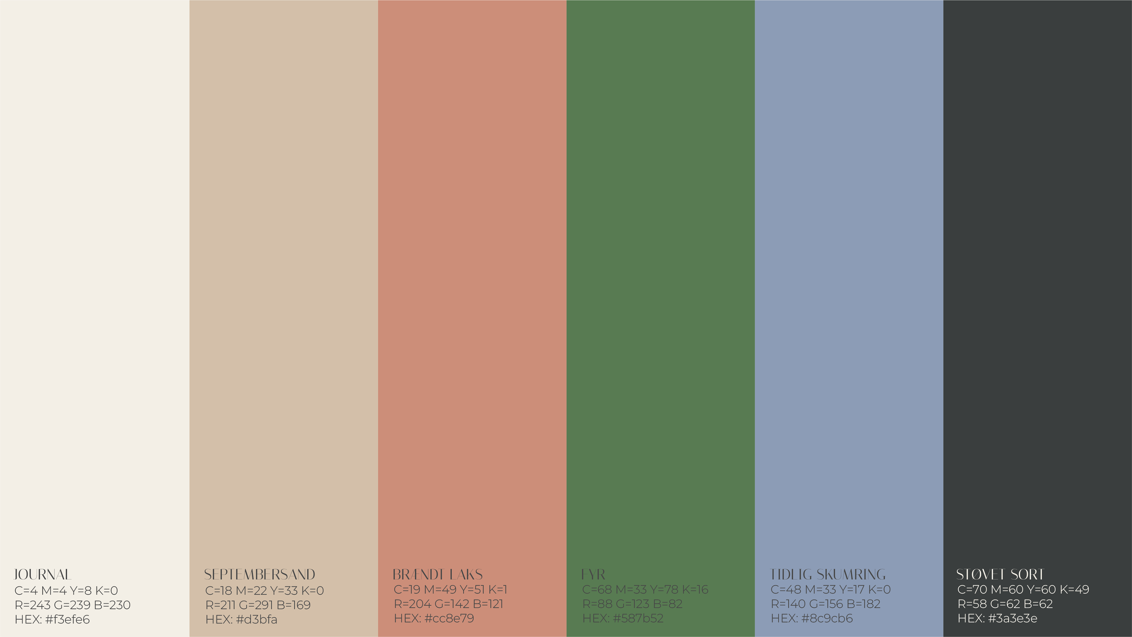
Color palette
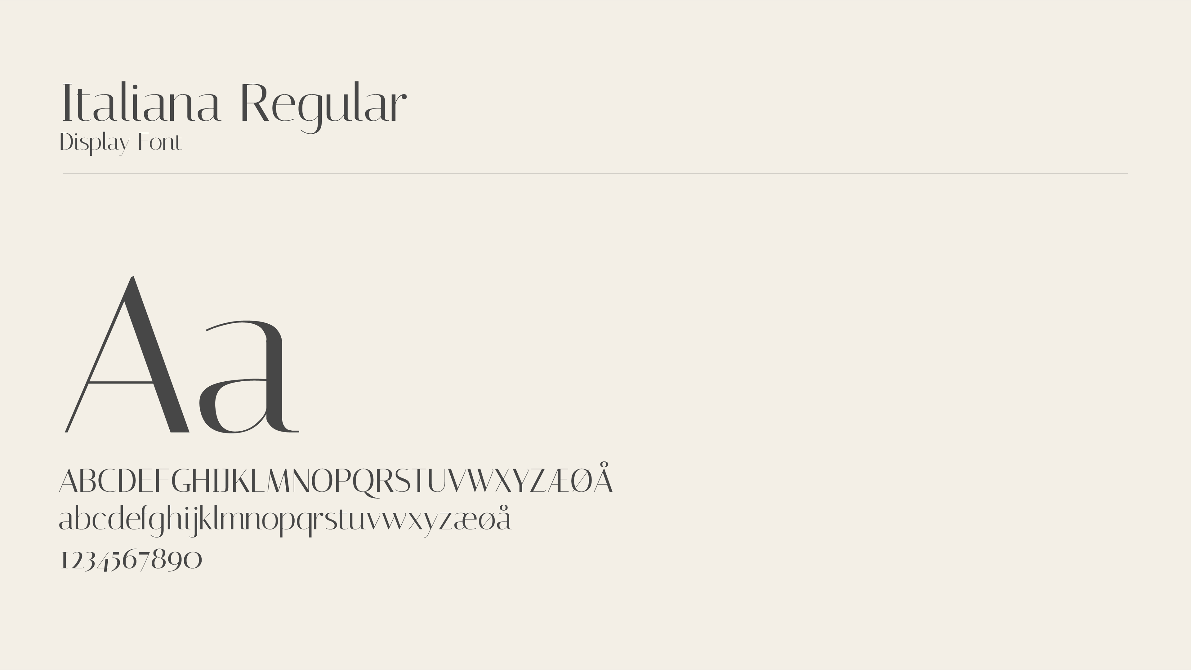
Header font
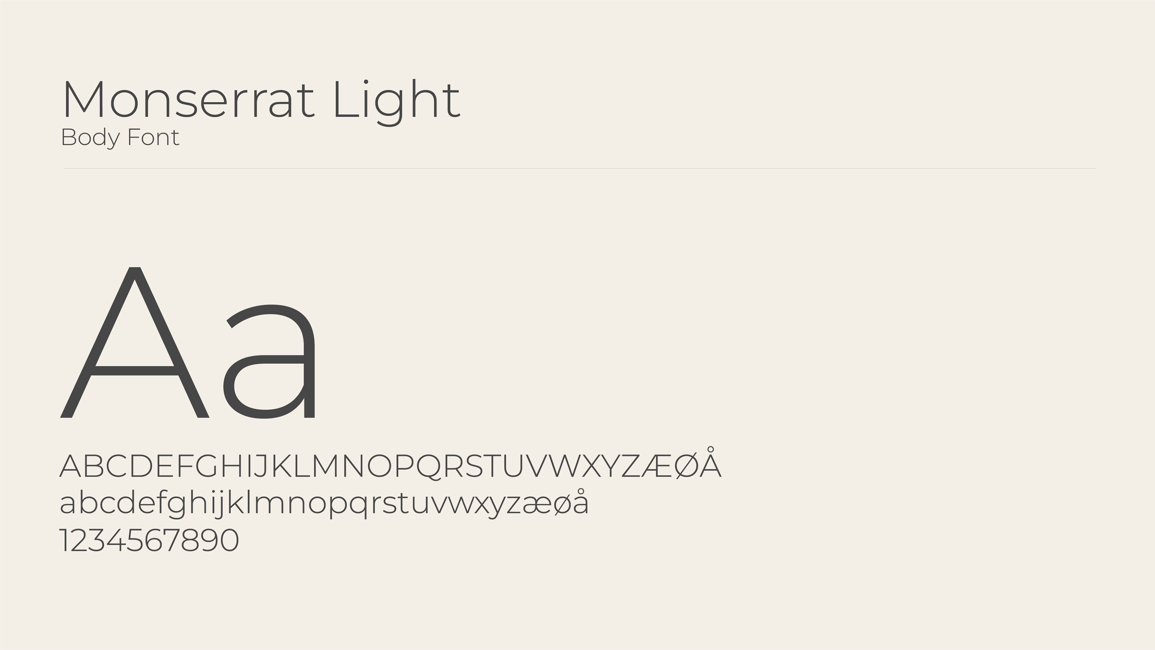
Body font
Name tag without logo
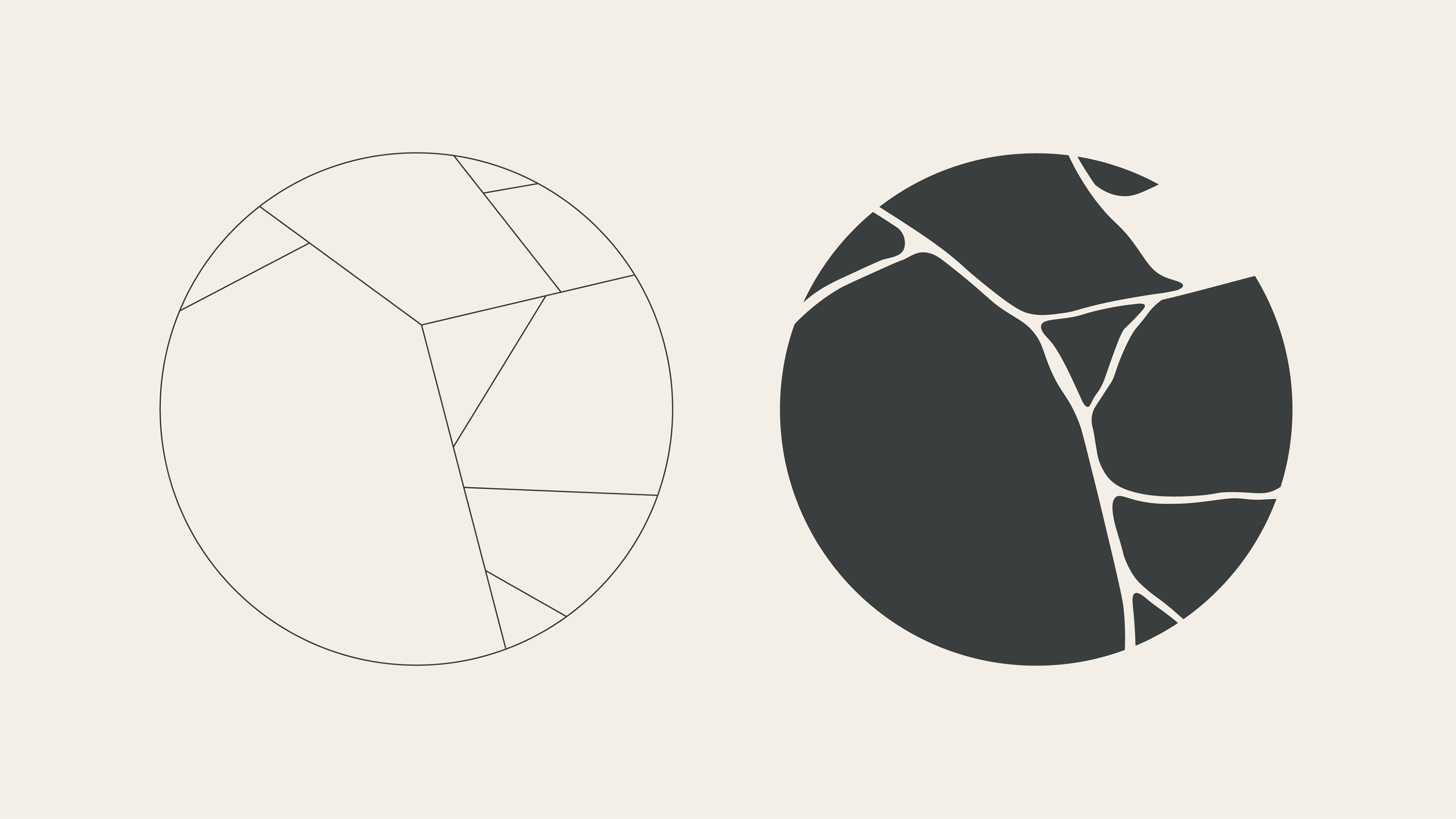
Logo
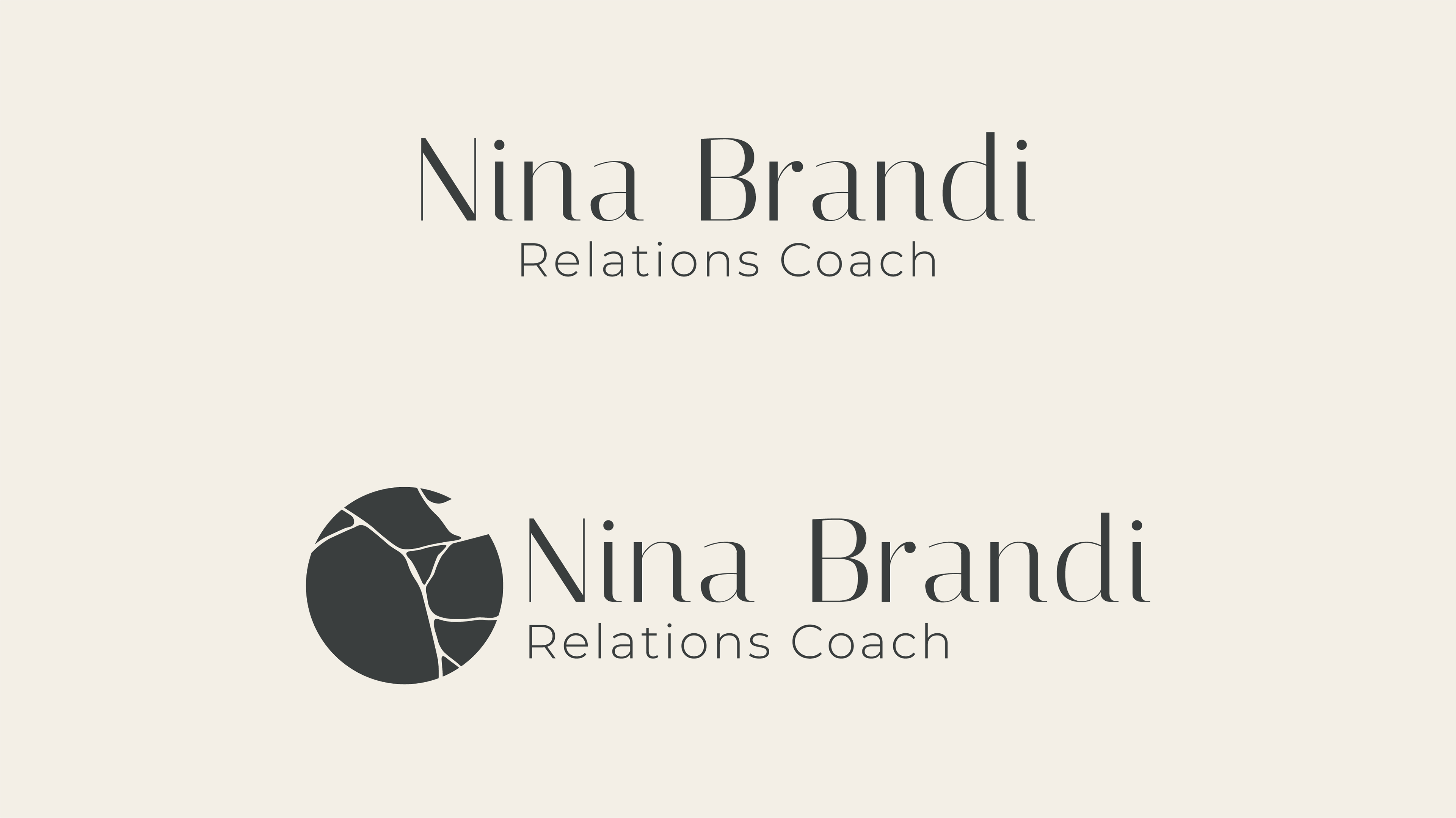
Name tag with and without logo
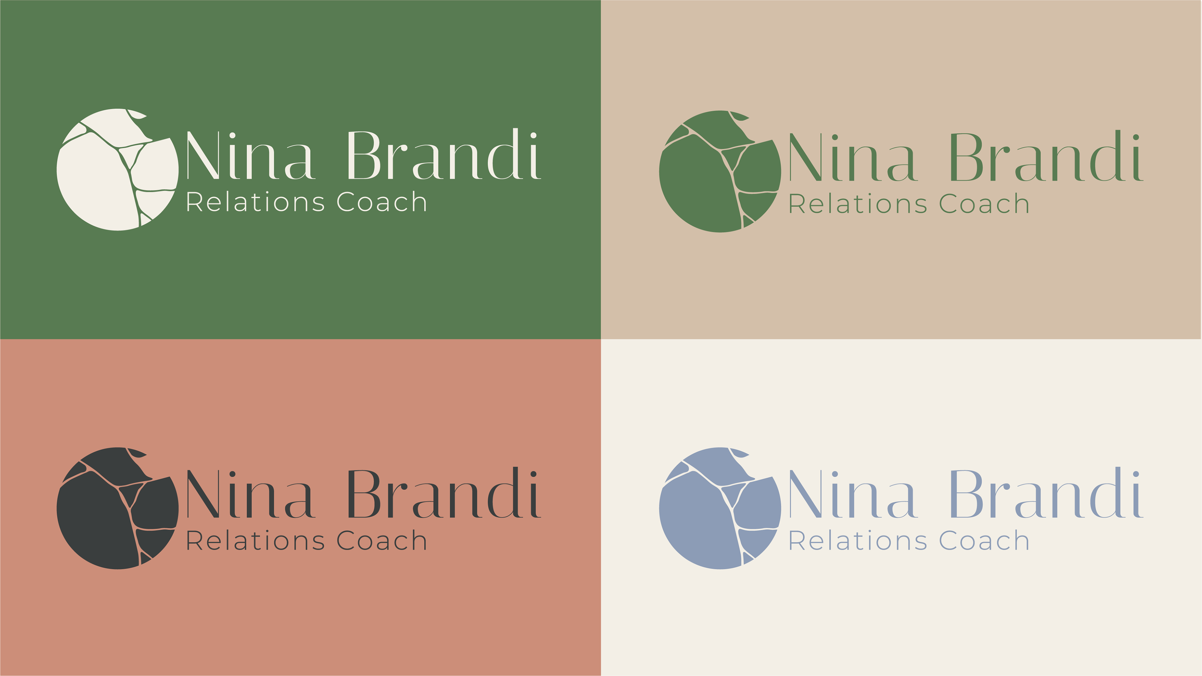
Color and logo guide
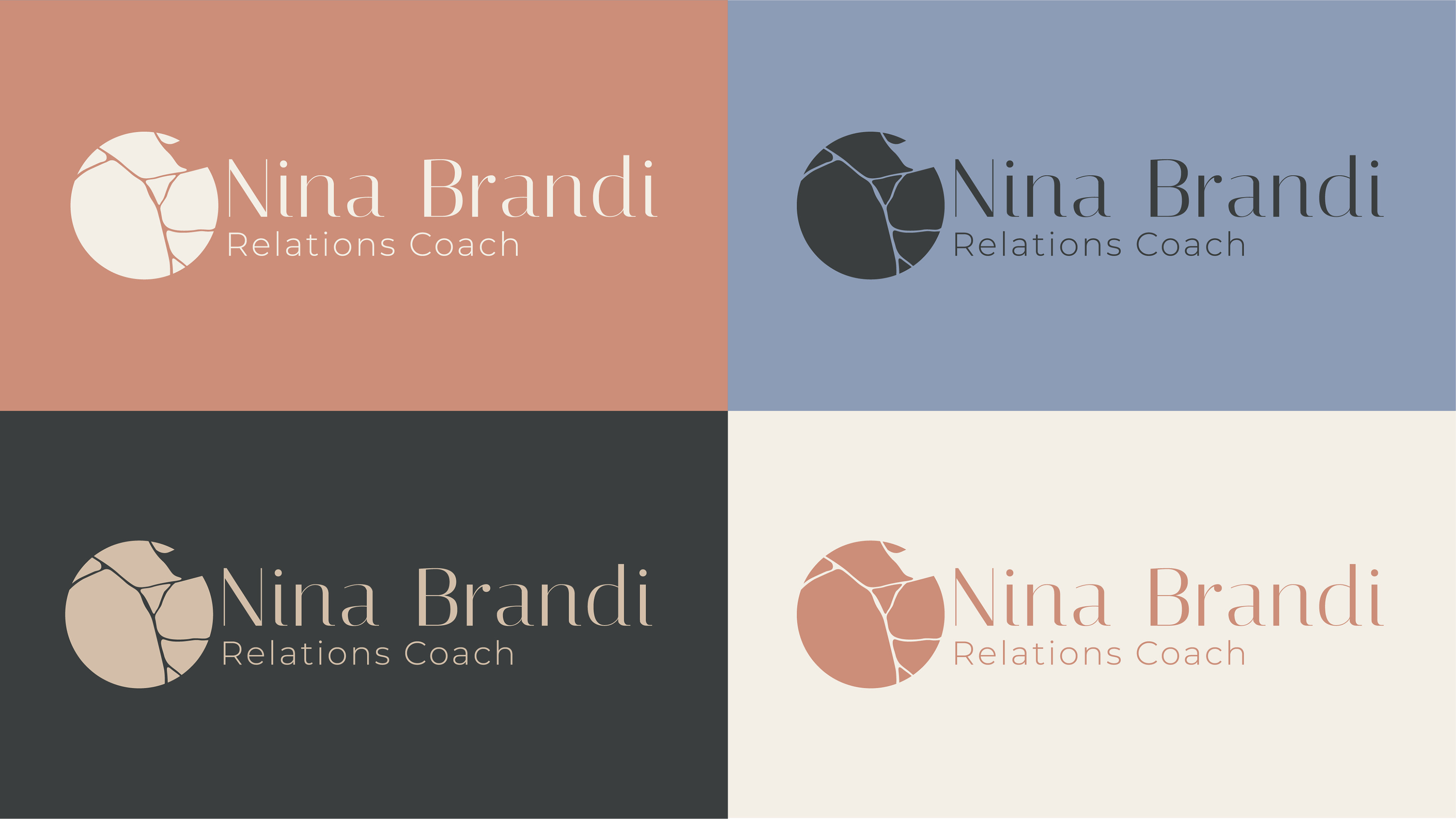
Color and logo guide
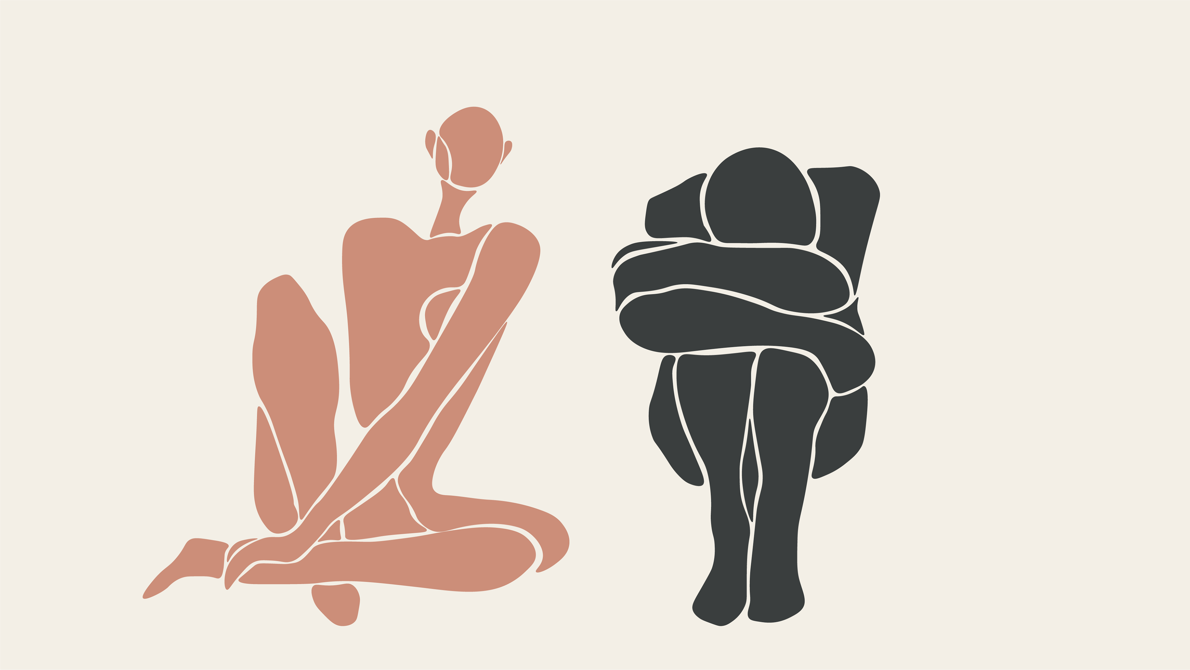
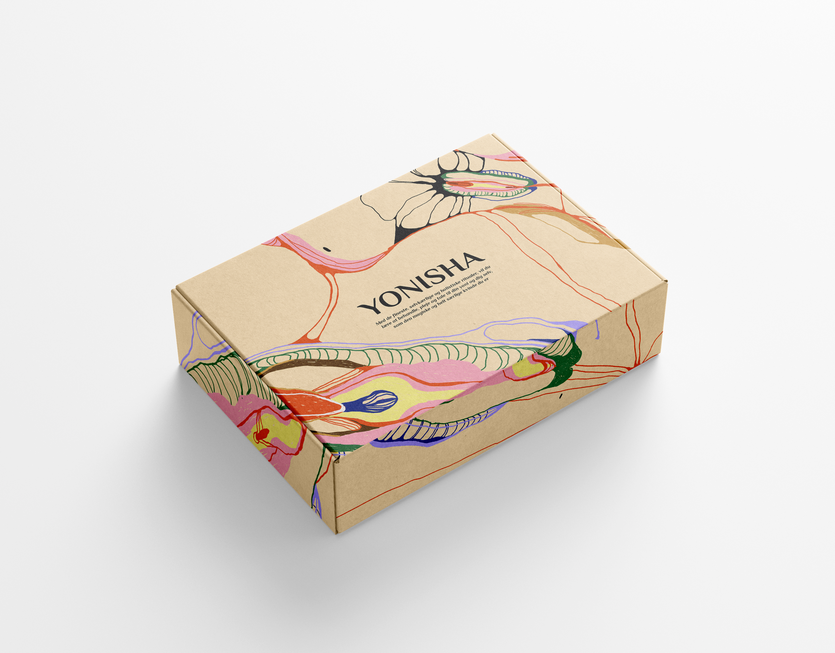
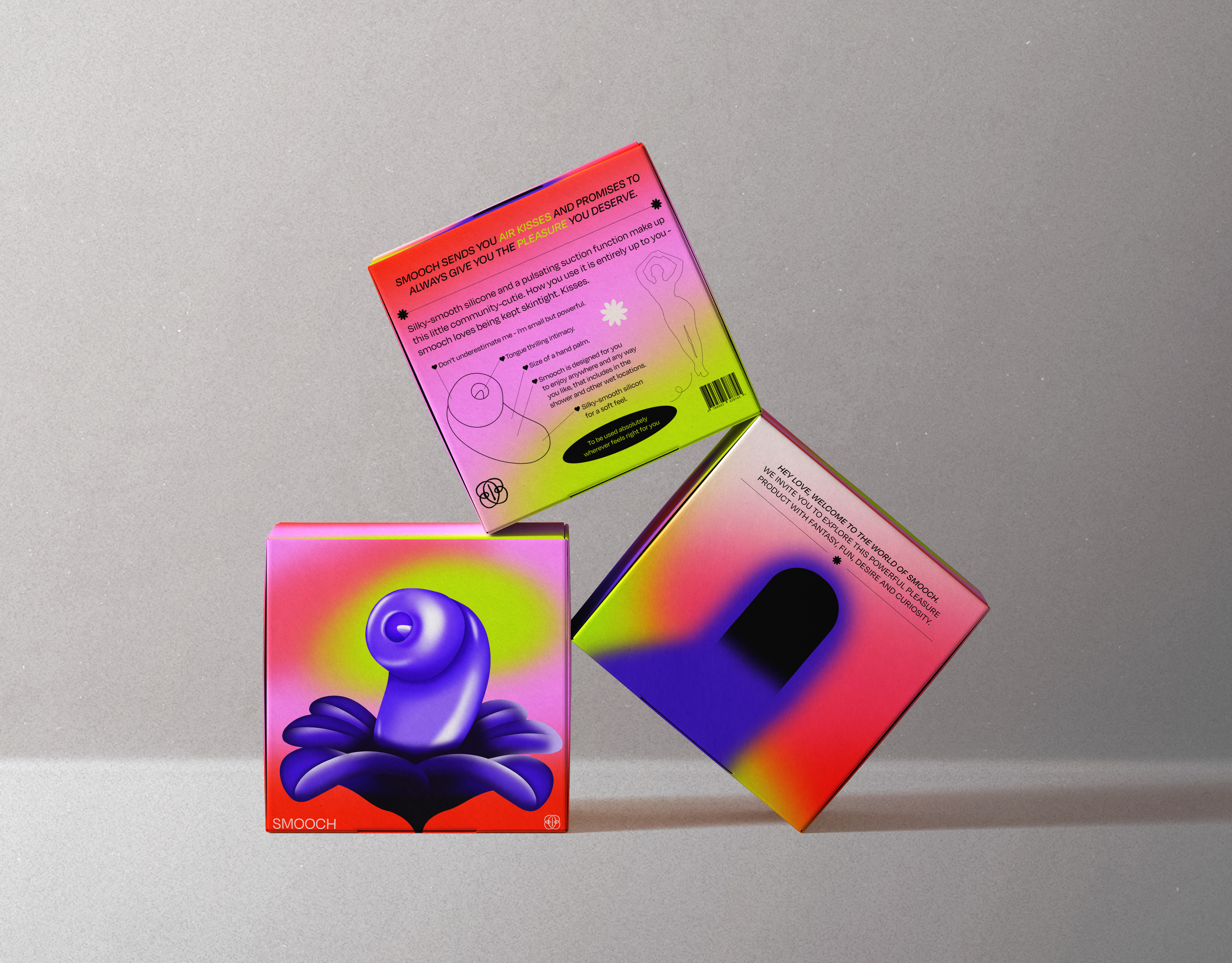
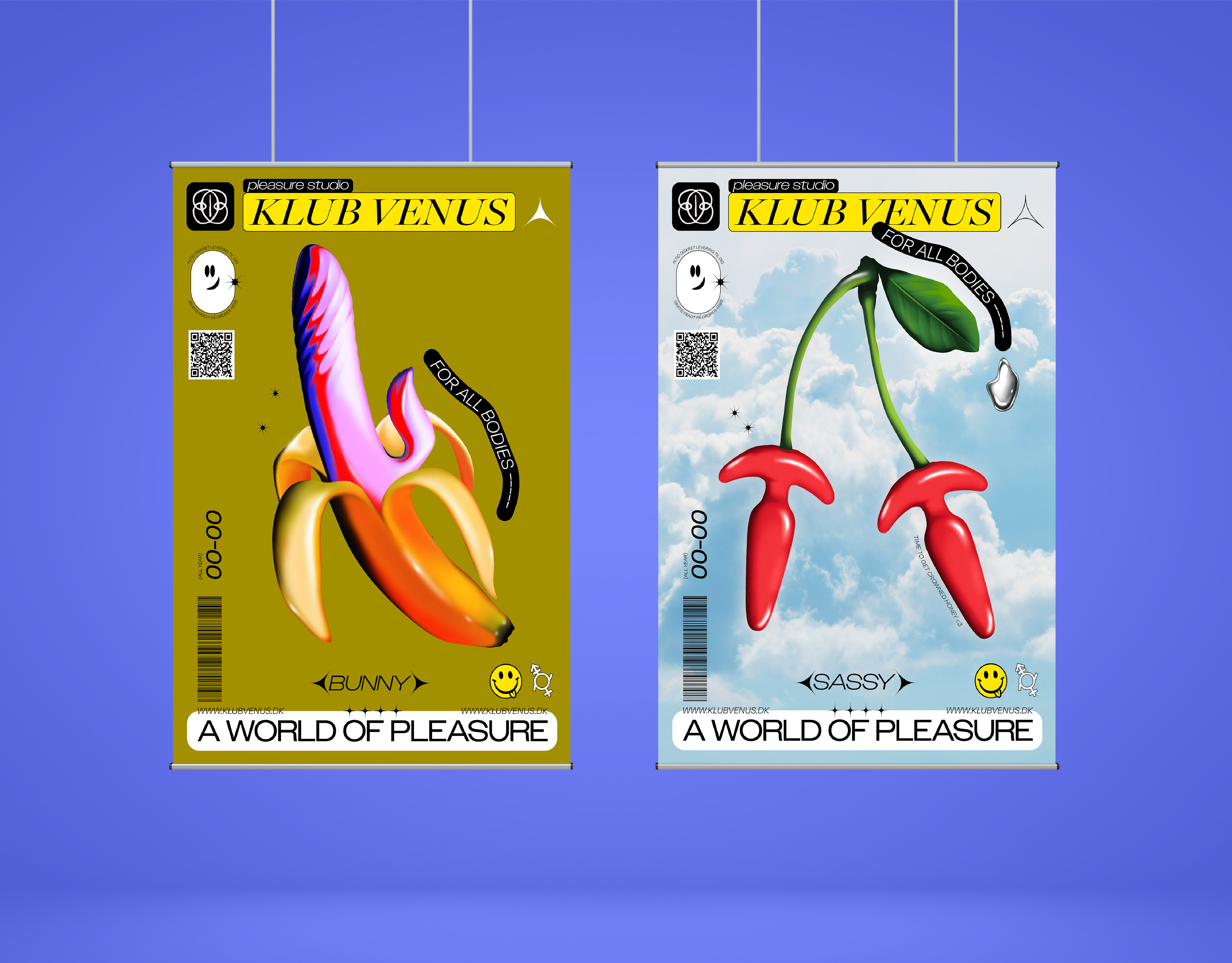
Illustration style
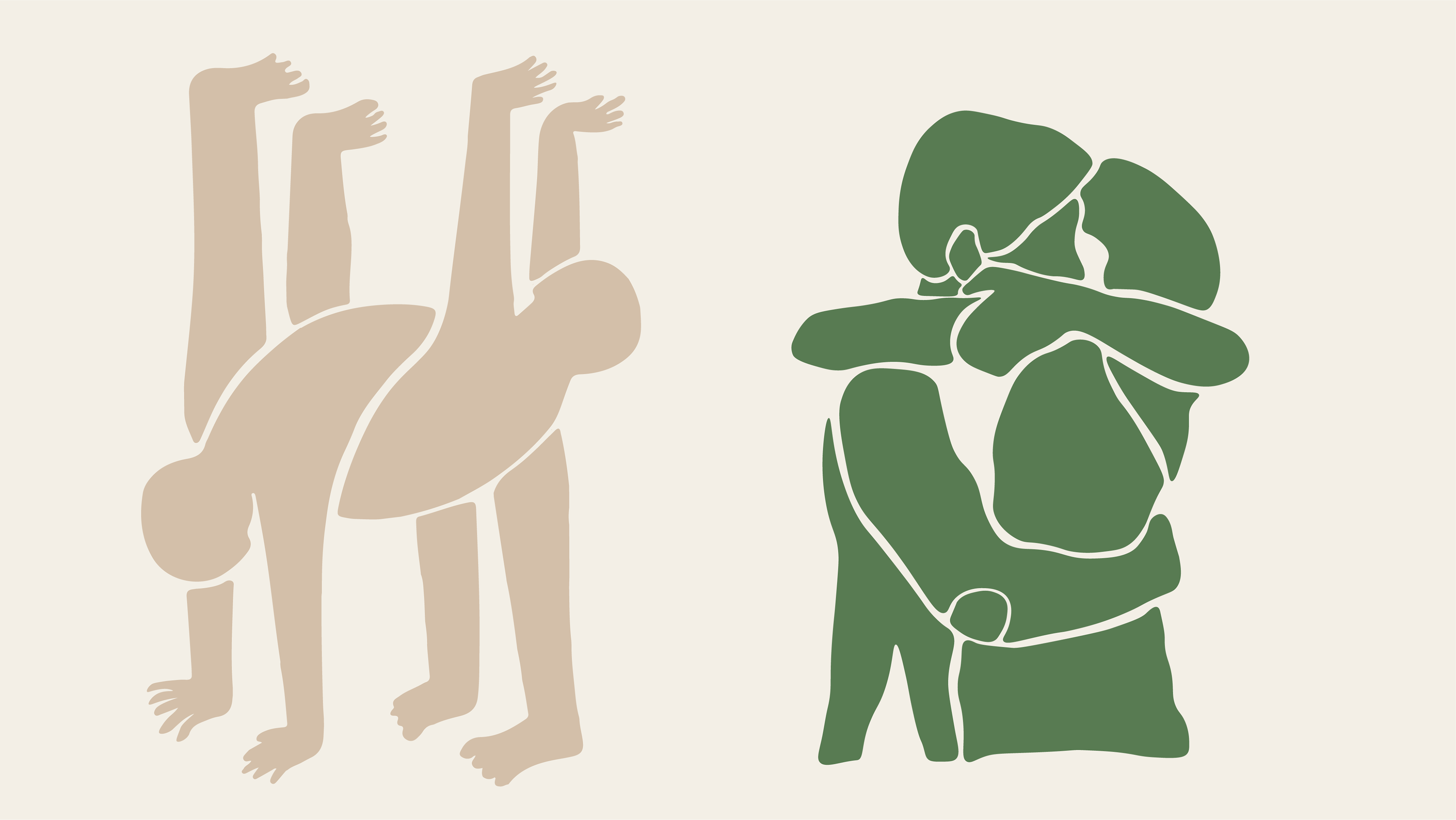
Illustration style
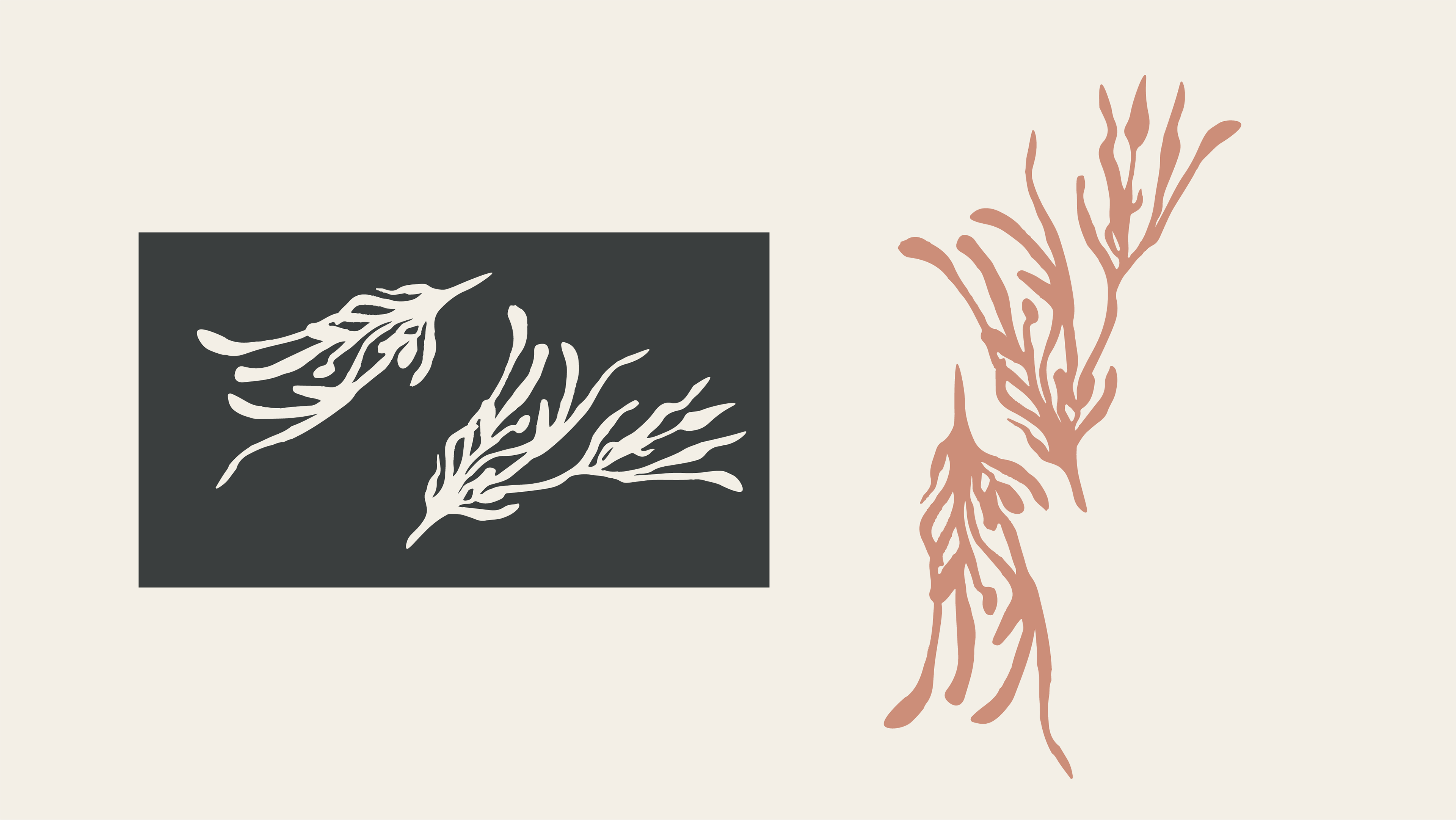
Illustration style
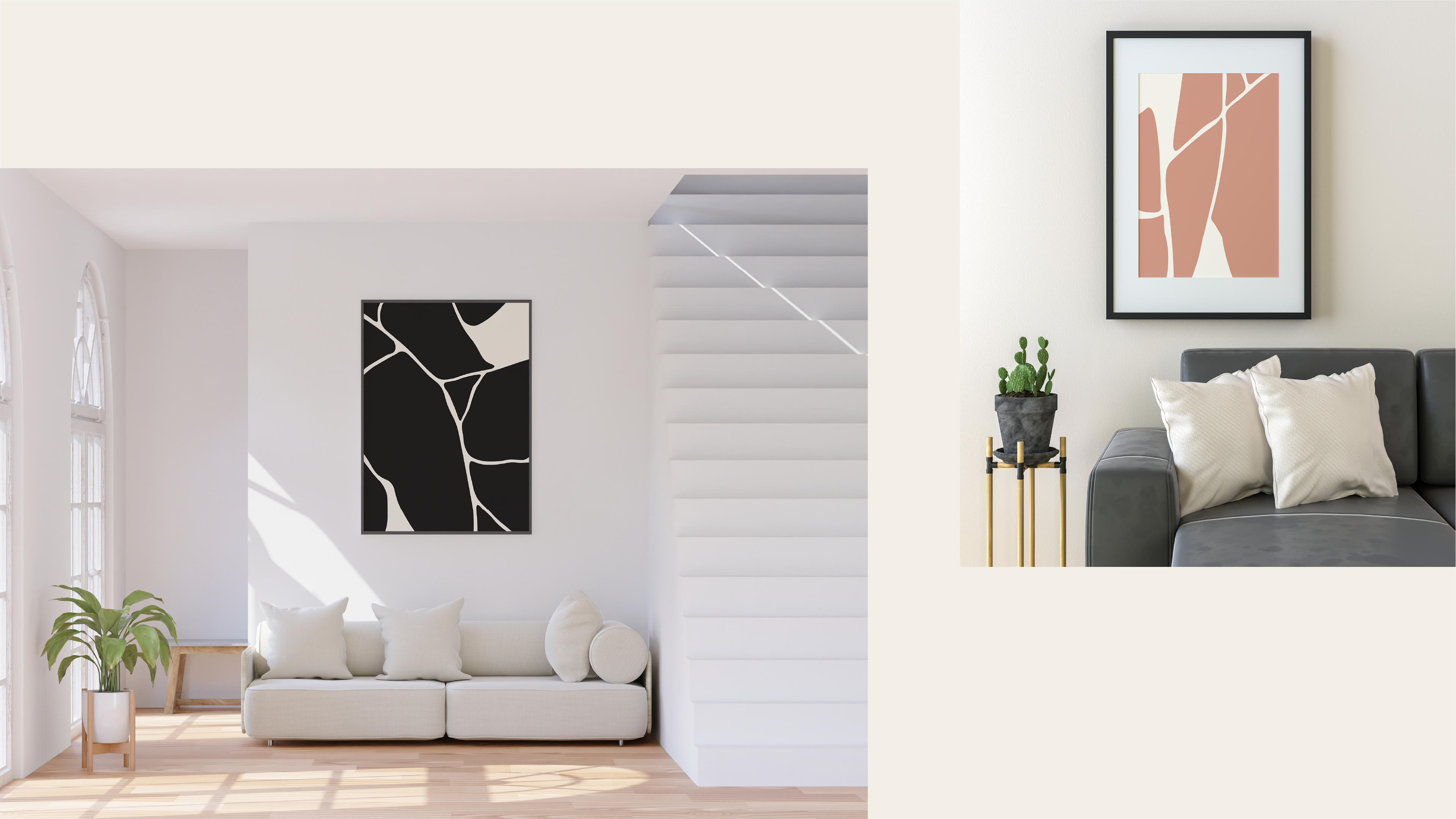
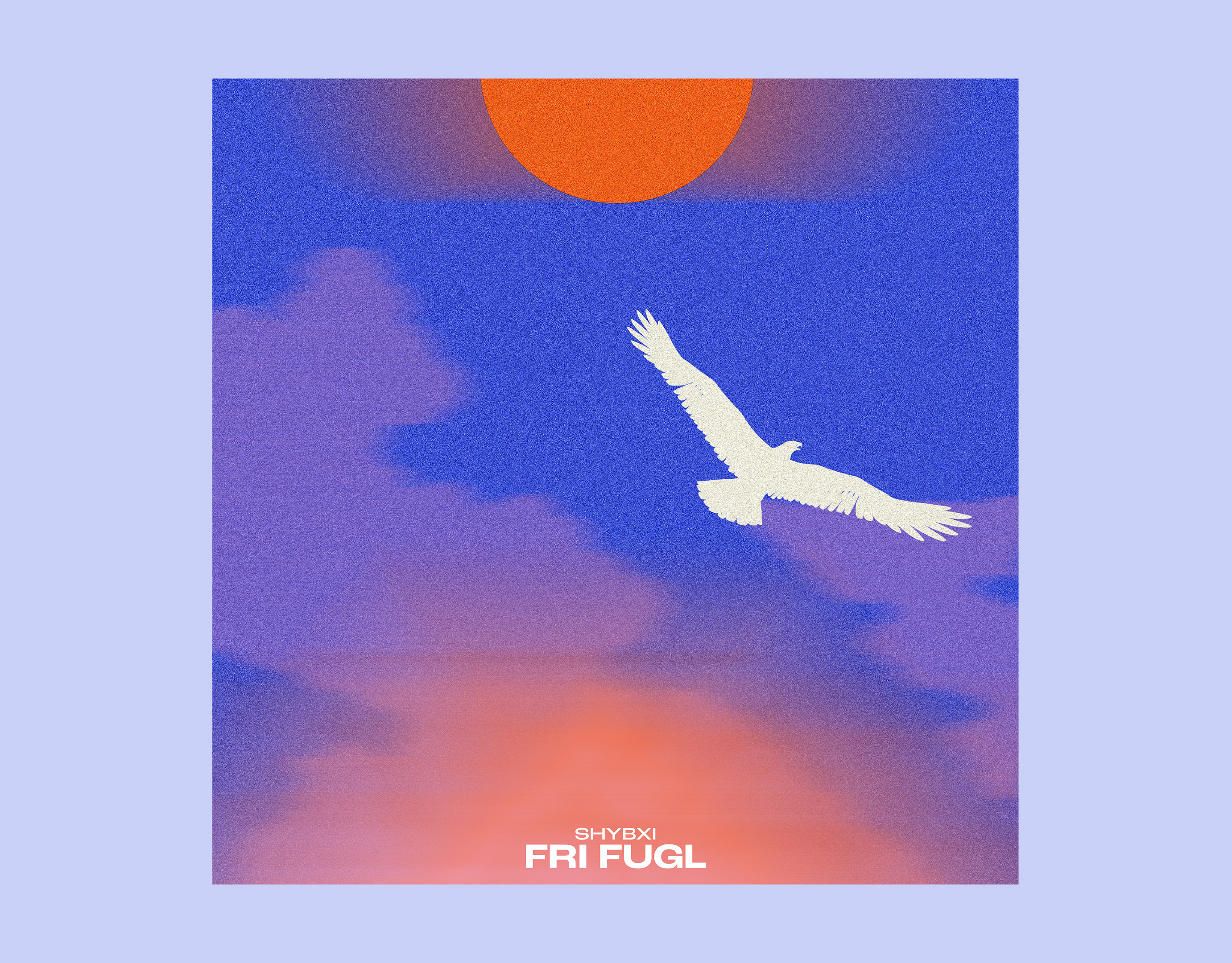
Posters for Ninas workspace
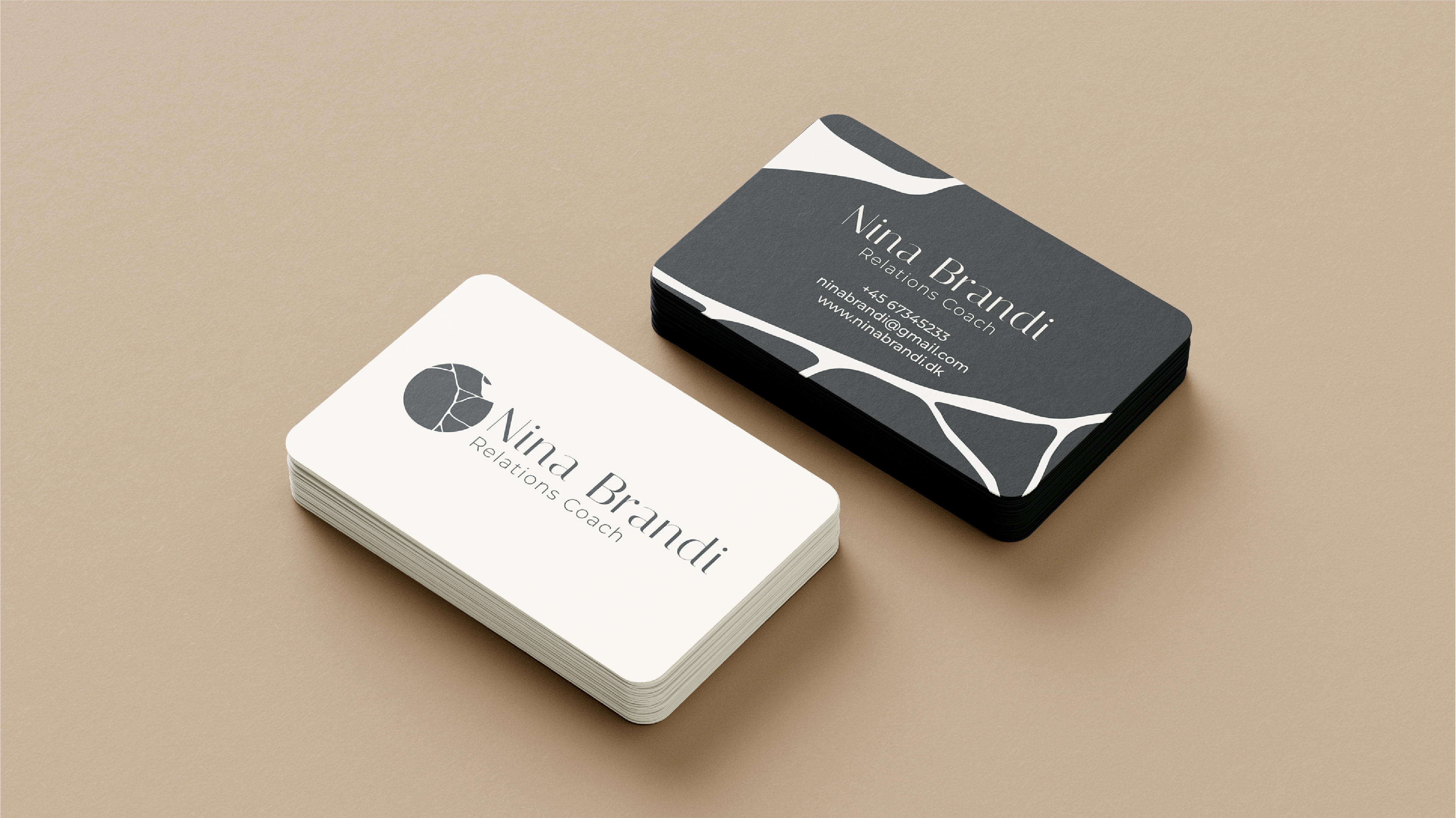
Business cards
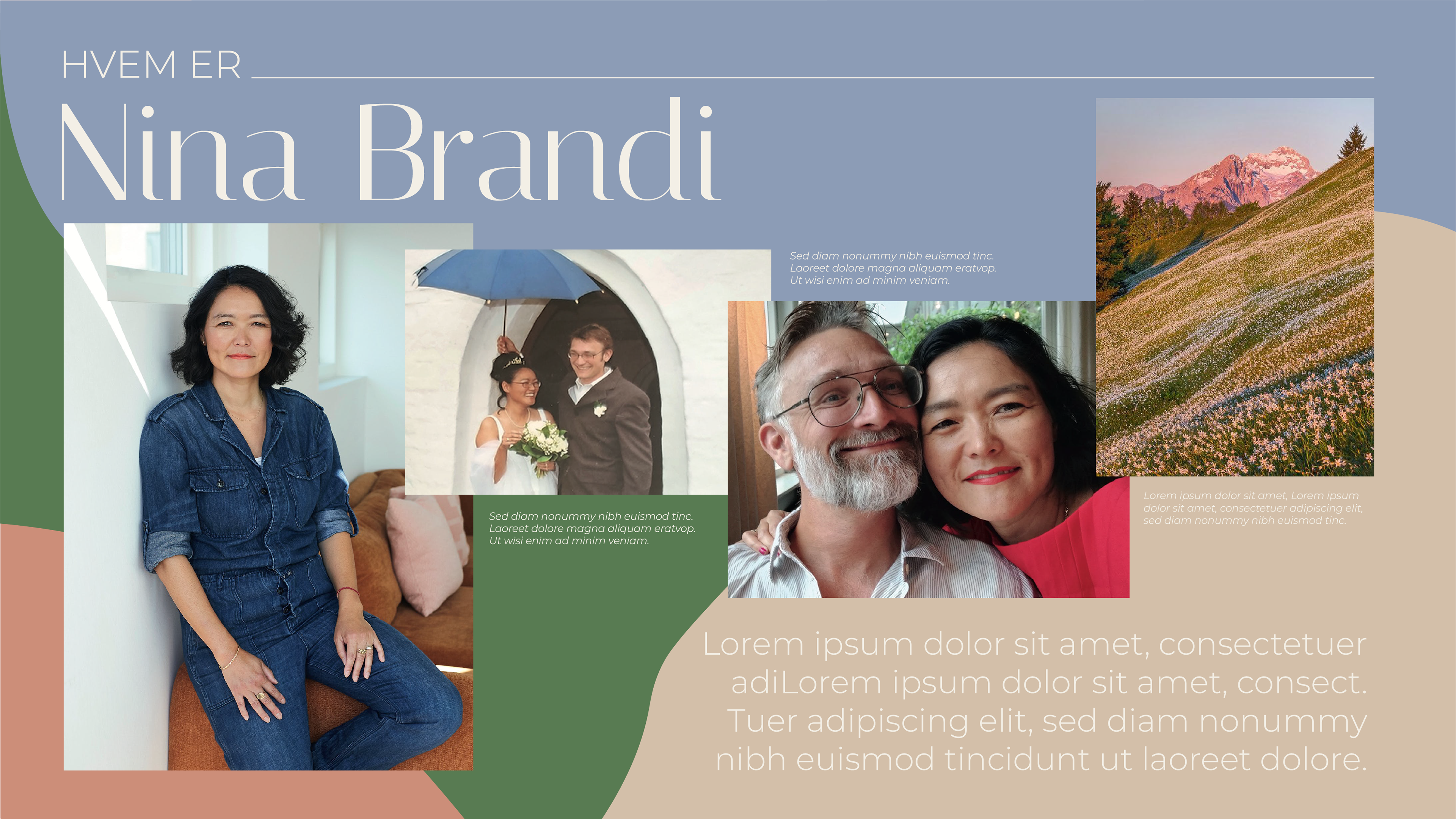
Collage styles idea for the subsite on the website
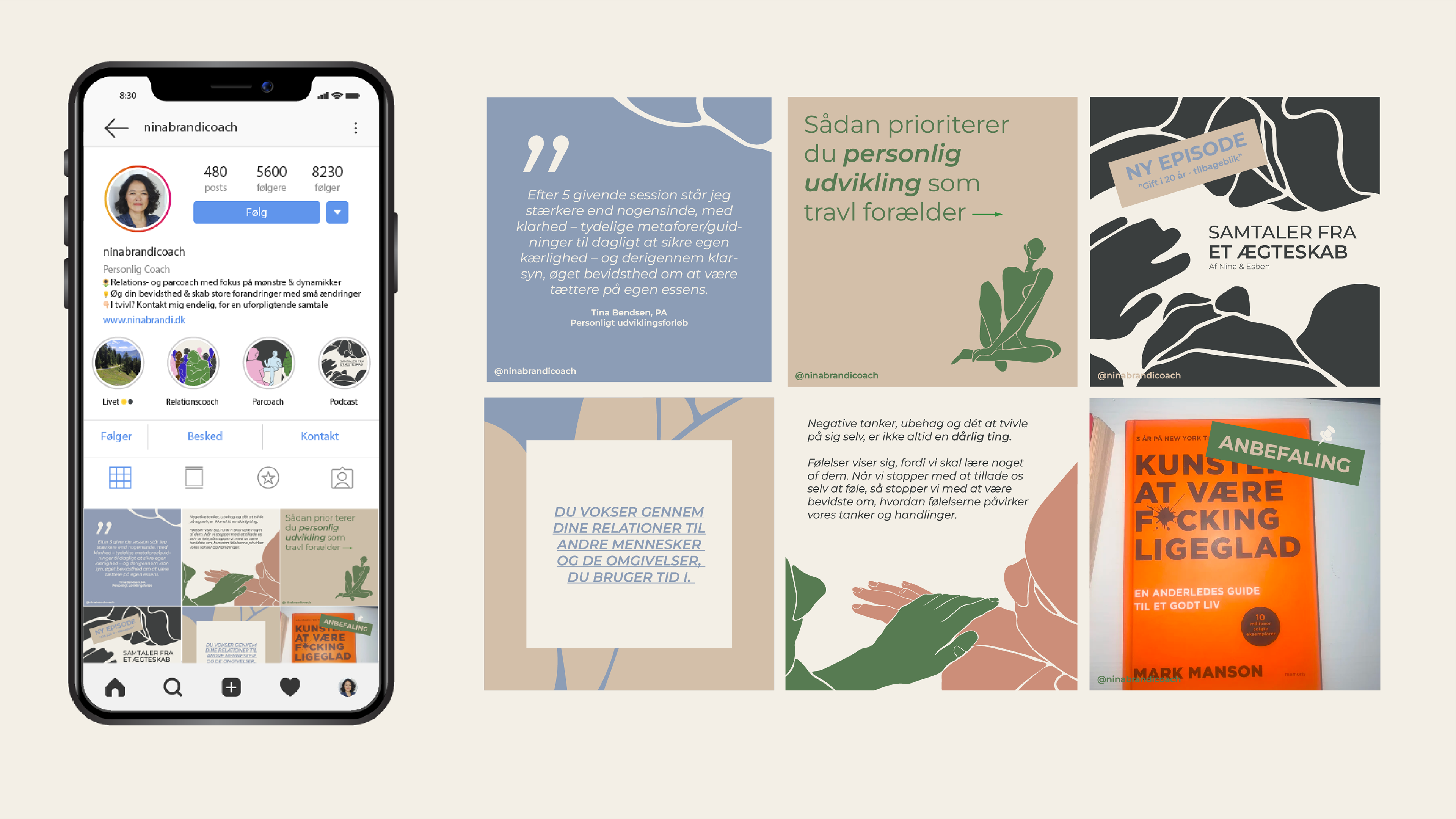
IG-strategi and development of content-formats within the brandstory and visual identity