nucleus

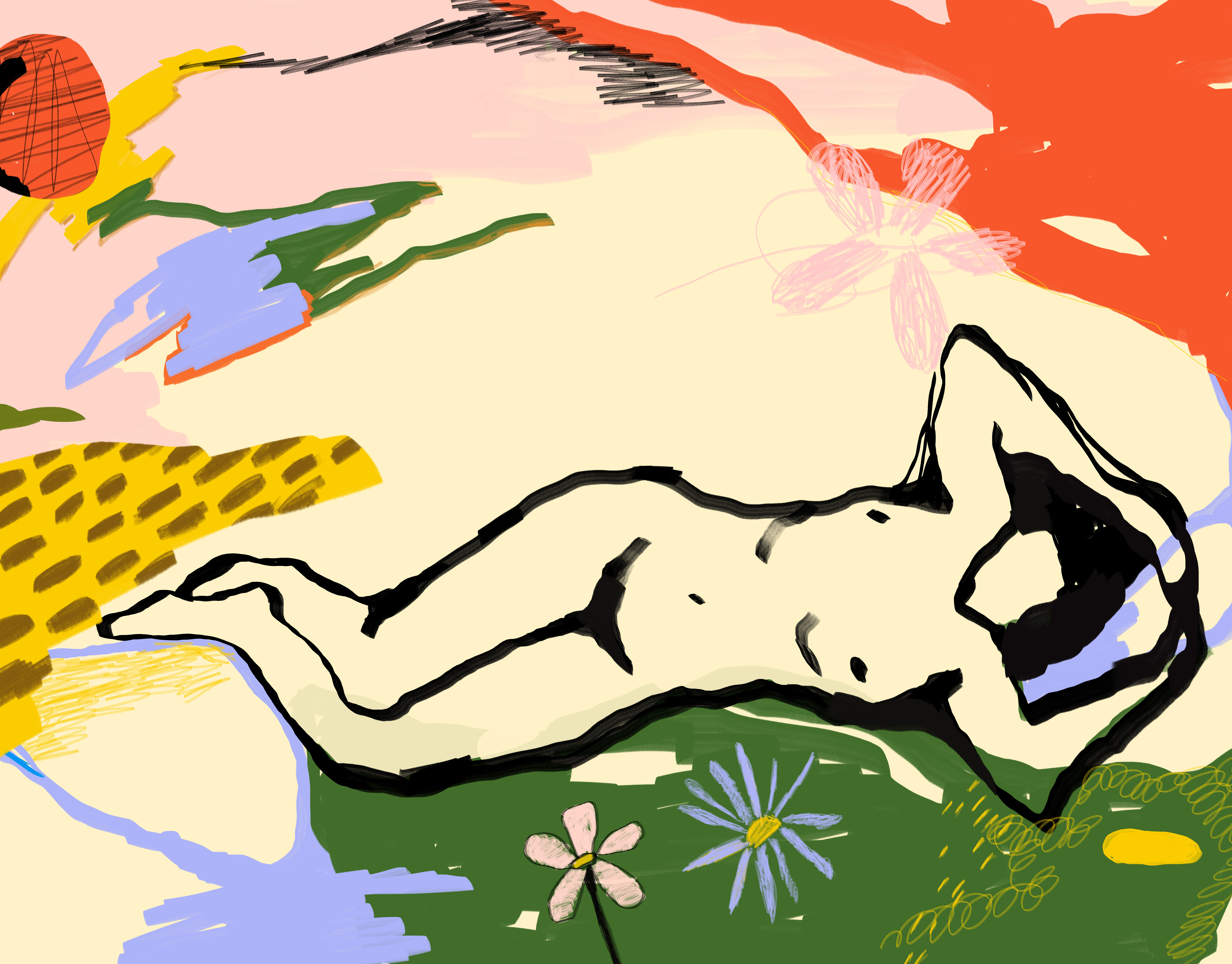
Visual identity and packaging for a fictive brand called 'nucleus'. I felt like experimenting with something minimalistic and simple. Nucleus means 'the central and most important part of an object, movement, or group, forming the basis for its activity and growth'. To me, the visual language should participate in the brandstory, name etc. Therefore I made this abstract illustration that symbolizes growth. Skin is constantly growing and developing - just like us humans. This fictive product aims to tell that story and of course sell and produce products that embraces that fact.

Name and logo - I'm using the comma to indicate that, just like with our skin, there's always a time that comes next

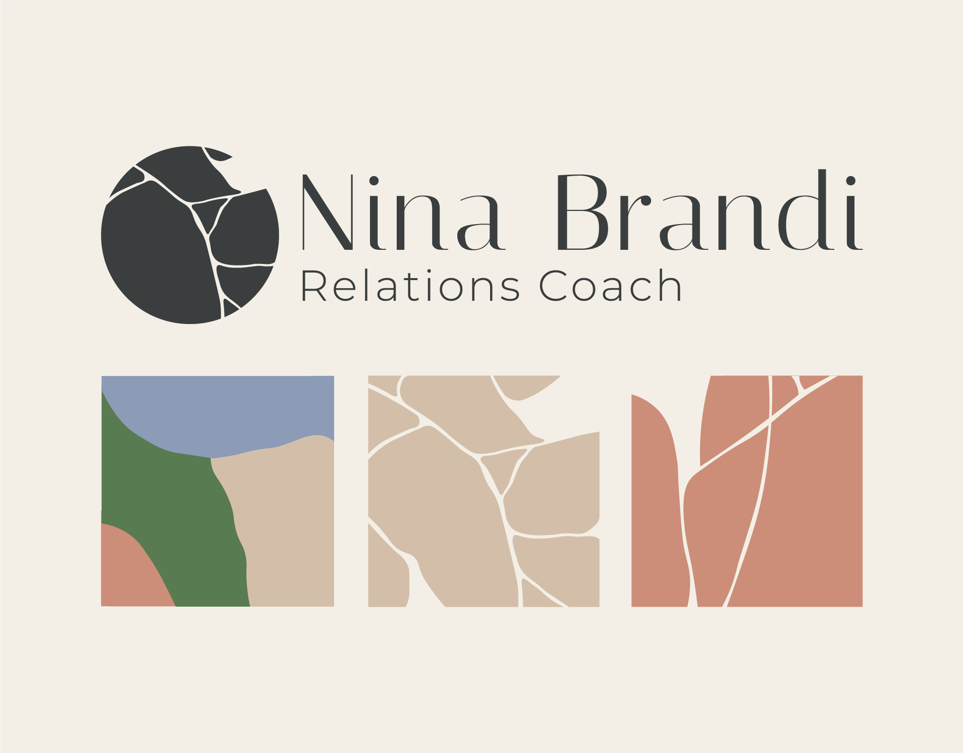
Logo and color variations

Logo and color variations

Color Palette

Display Font

Body Font

Main Illustration

Illustration and color variations

Product packaging experiments

Product packaging experiments

Product packaging experiments and content format
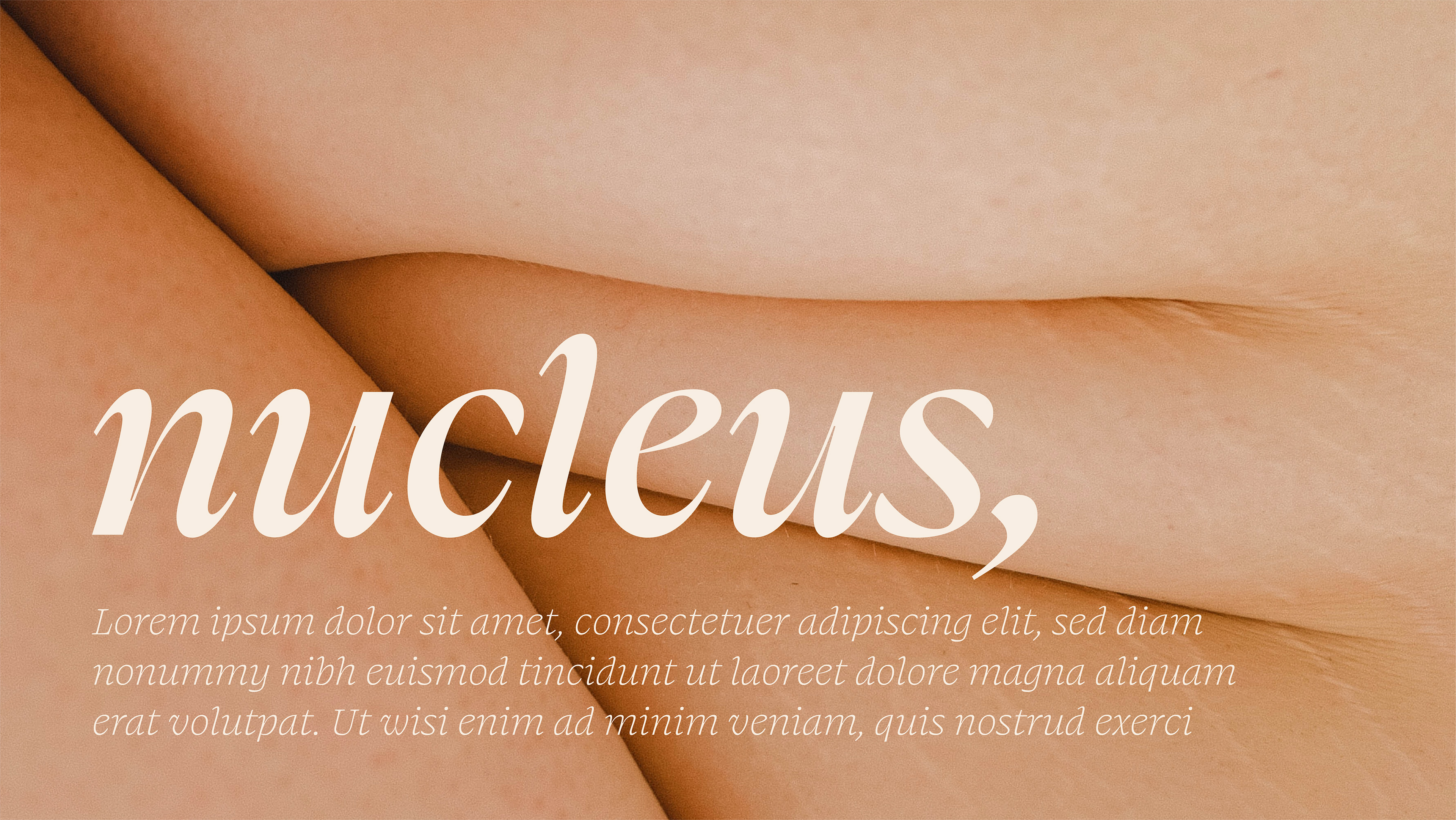
Content format
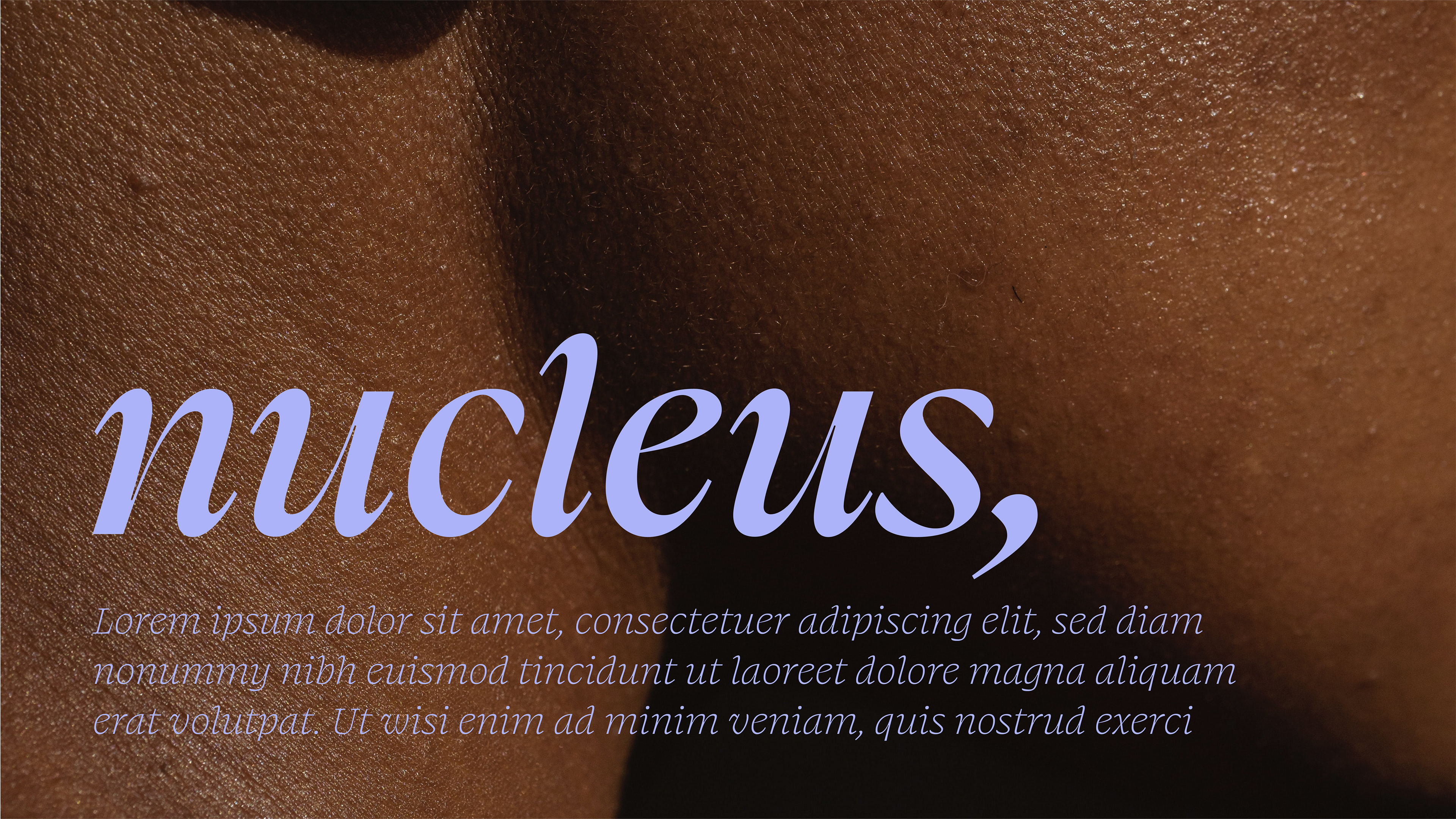
Content format
Content format
Content format

Website content experiments

Instagram story content ideas

SoMe content ideas

SoMe content ideas
You may also like

Back to Top